Zetland: A Standout Display Font for Digital Branding
There’s that moment—right after you’ve finalized your client’s new coaching website layout—when you scroll back up to the hero section and pause. The imagery is strong, the CTA button is perfectly placed, but something feels… safe. Too familiar. That’s when I reached for Zetland. Not as a last-minute flourish, but as a deliberate brand amplifier—and it transformed the entire tone of the page before I’d even exported a single mockup.
What Zetland Brings to the Screen
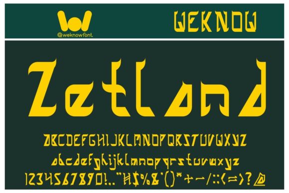
Zetland is a premium display font with bold personality: clean geometry meets subtle organic warmth. It’s not overly ornate, but it’s never generic—think confident letterforms with balanced spacing, open counters, and just enough character in its terminals to feel intentional, not accidental. On screen, it holds weight without heaviness, and scales beautifully from desktop headlines down to tablet-sized banners. Unlike many decorative display fonts, Zetland avoids visual noise—no excessive swashes or unpredictable alternates that distract or break rhythm. It’s designed to command attention, then let the message land.
Real-World Testing Across Layouts
I tested Zetland across three key web contexts: a boutique online store homepage, a course sales landing page, and a creative portfolio site. In each case, I used it exclusively for primary headings—hero titles, section dividers, and feature headers—paired with a neutral sans serif (Inter, set at 400 weight) for all body copy, navigation, and supporting text.
- Hero sections: Zetland shines over full-width image banners—especially with light text overlays on muted backgrounds. Its generous x-height and clear letter shapes remain legible even with subtle CSS blur or gradient overlays.
- Landing page CTAs: Used at 36px on desktop (28px on mobile), Zetland gave “Enroll Now” buttons unexpected gravitas—not shouty, but unmistakably inviting. No extra styling needed.
- Portfolio project titles: Paired with minimalist card layouts, Zetland added quiet confidence. It didn’t compete with photography or illustrations—it framed them.
Responsive Behavior & Readability Notes
Zetland performs reliably across breakpoints. At 24px and above, it reads cleanly on all modern devices—including mid-range Android tablets where some display fonts soften or pixelate. I did notice slight tightening in letter spacing below 20px, so I avoided using it for subheadings smaller than 22px on mobile. For accessibility, it’s best reserved for large, short-form text: headlines, labels, and decorative accents—not form fields, error messages, or navigation links. Its contrast ratio against white or light gray backgrounds comfortably exceeds WCAG AA standards at headline sizes, especially when set with at least 1.2 line-height.
One practical tip: if you’re layering Zetland over photos or textured backgrounds, add a subtle text-shadow: 0 1px 2px rgba(0,0,0,0.15)—not for drama, but to ensure crisp definition on lower-DPI screens.
Smart Pairing for Digital Clarity
Zetland thrives in contrast. I consistently paired it with Inter (variable font, system-friendly) for body and UI text—its rational proportions create elegant tension with Zetland’s expressive stance. For more editorial or luxury-leaning sites, a refined serif like Lora or EB Garamond works beautifully in larger paragraph sizes, letting Zetland anchor hierarchy without clashing. Avoid pairing it with other display fonts or scripts unless intentionally creating a high-contrast campaign graphic—the goal is distinction, not competition.
Crucially, Zetland includes a full set of OpenType features: standard ligatures, discretionary ligatures, and stylistic alternates. I used the alternate ‘a’ and ‘g’ in one client’s logo lockup for a custom touch—without needing custom vector work. Just enabled via CSS font-feature-settings: "salt".
Licensing, Formats & Practical Checks
Before deploying Zetland on any live site, I confirmed the license covers web use (it does—both self-hosted and via CDN). The package included WOFF2 files—lightweight and widely supported—as well as OTF and TTF for design tools. No variable font axis, but five distinct weights (Light through Bold) gave flexibility for layered hierarchy without switching type families. Multilingual support covers Latin Extended-A, so accented characters in Spanish, French, and German content render cleanly. If your audience includes non-Latin scripts, verify coverage separately—but for most English-first digital brands, it’s production-ready.
One final note: Zetland isn’t built for long-form reading. Don’t use it for blog posts, pricing tables, or FAQ accordions. Its strength is *impact*, not endurance—and respecting that boundary is what makes it feel premium, not pretentious.
When a font stops being “just typography” and starts shaping how users feel before they even read a word—that’s when you know you’ve chosen right. Zetland doesn’t shout. It leans in, makes eye contact, and says, “This matters.” And in digital spaces crowded with sameness, that kind of quiet confidence? That’s worth every byte.